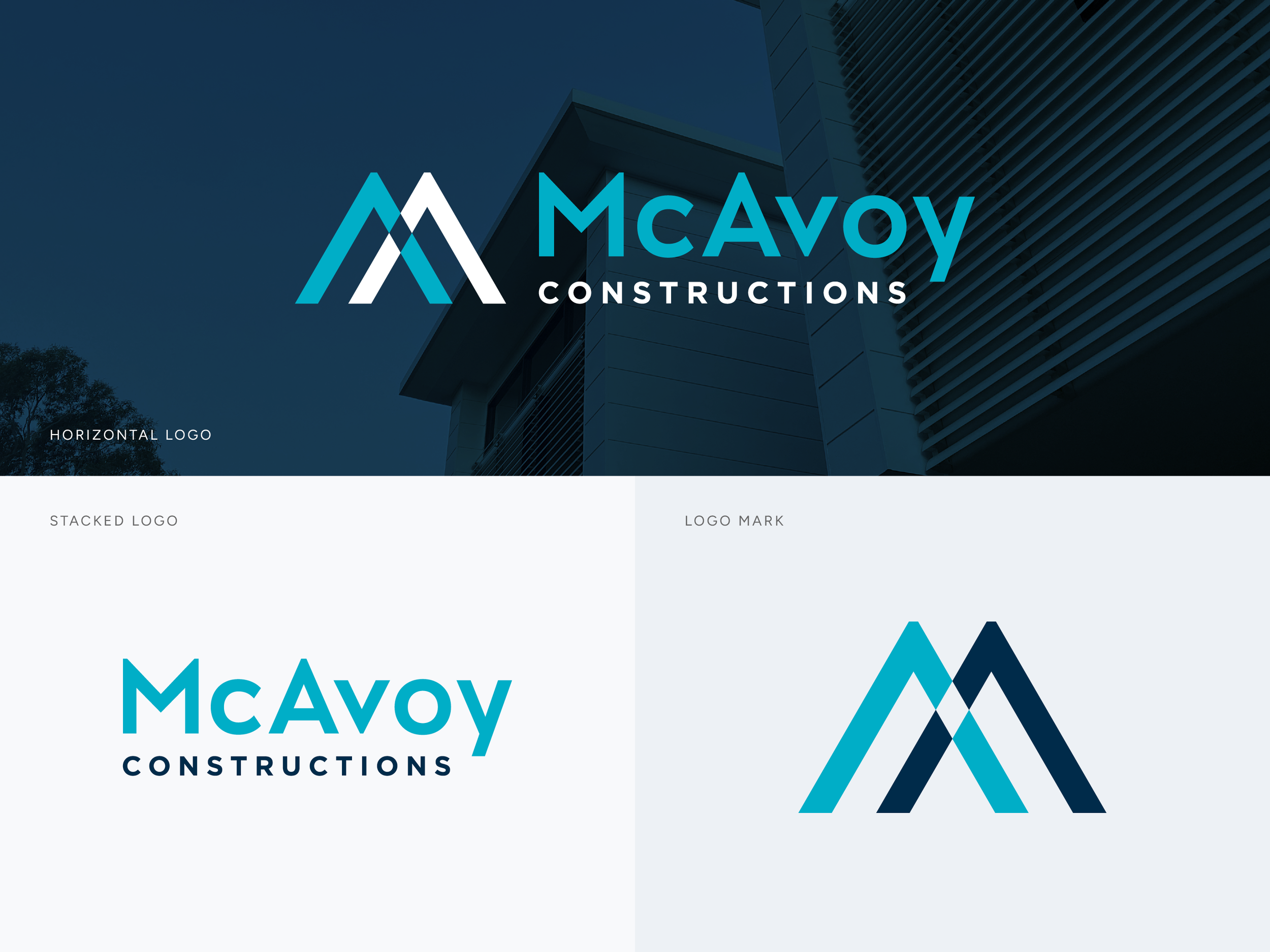

McAvoy Constructions
BRAND IDENTITY
WORK-WEAR
THE BRIEF: McAvoy Constructions aimed to refresh their brand identity to reflect their growing presence in the commercial construction sector, while preserving elements of their original branding for continued recognition.
THE SOLUTION: We crafted a modernised brand identity featuring a new logo design and an updated colour palette, with social media profile assets to match. The bold, clean lines of the logo not only symbolize the company’s professionalism and growth but also subtly resemble the letter ‘M,’ representing structural formwork and construction in an abstract, architectural manner. This approach helped shift the perception of the brand, establishing it as both a serious player in the commercial sector and a business with strong, authentic roots.


